Standard Deviation Shading Tool
Parameters
Shading Options
Custom Range
Shaded Area Results
The standard deviation shading tool is a user-friendly way to visualize how data spreads in a normal distribution by highlighting specific areas under a bell curve. By inputting the mean and standard deviation, you can shade normal distribution ranges to see the proportion of data within one, two, or three standard deviations. This tool is ideal for students, educators, and analysts who want to understand data patterns in datasets like grades or measurements. This guide explains how the tool works, its benefits, and how it helps you grasp the normal distribution range. Ready to explore? Try our main statistics tool to visualize data distributions.
What Is Standard Deviation Shading?
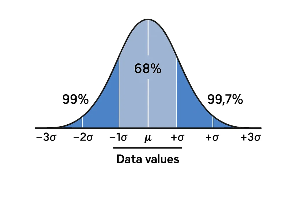
Standard deviation shading involves highlighting specific regions under a bell curve to show the percentage of data within certain ranges in a normal distribution. A normal distribution is a symmetric, bell-shaped pattern where most data clusters near the mean (average), and the standard deviation measures how spread out the data is. The empirical rule, often associated with normal distributions, states:
-
68% of data falls within one standard deviation (±1σ) of the mean.
-
95% falls within two standard deviations (±2σ).
-
99.7% falls within three standard deviations (±3σ).
The standard deviation shading tool lets you visualize these percentages by shading areas under the curve, making it easy to see how data is distributed. For example, shading ±1σ shows the 68% region, helping you understand data concentration.
How to Use the Shading Tool
Using the standard deviation shading tool is simple and intuitive. Here’s a step-by-step guide to highlight area under bell curve:
Enter the Mean (μ): Input the average of your dataset. For example, for test scores, the mean might be 70.
Input the Standard Deviation (σ): Enter the standard deviation to define the curve’s spread. A standard deviation of 5 means most scores are close to 70.
Select a Range to Shade: Choose a range, like ±1σ, ±2σ, or a custom interval (e.g., 65 to 75). The tool shades the corresponding area under the curve.
Generate the Graph: Click “Generate” to create a bell curve with the shaded region, showing the percentage of data within your selected range.
Customize (Optional): Adjust colors or zoom to focus on specific areas for clearer visuals.
Example: For a dataset with a mean of 100 and a standard deviation of 10, shading ±1σ (90 to 110) highlights 68% of the data. This visual shows most values cluster near 100.
Why Visualize a Bell Curve?
Visualizing a normal distribution range with a shading tool offers several advantages:
Simplifies Learning: Shaded areas make it easy to understand how data spreads in a normal distribution.
Highlights Key Ranges: See the 68%, 95%, or 99.7% regions clearly, aligning with the empirical rule.
Supports Analysis: Helps identify typical data ranges or outliers in datasets like exam scores or product measurements.
Engages Users: Interactive visuals are ideal for teaching or presenting statistical concepts.
For instance, a teacher might shade ±2σ to show students that 95% of grades fall within a specific range, while an analyst could highlight custom ranges to study data trends. To explore more graphing options, check out the empirical rule visualizer or Z-score tool.
FAQs
It’s a tool that highlights areas under a bell curve to show the percentage of data within specific standard deviation ranges in a normal distribution.
Shading visualizes the proportion of data within ranges like ±1σ (68%), making it easier to see how data spreads in a bell curve.
You need the mean and standard deviation of your dataset, plus the range you want to shade, to create a normal distribution range visual.
Yes, you can select specific intervals (e.g., 70 to 80) to highlight custom areas under the bell curve.
The bell curve area visualizer shows how data distributes in a normal dataset, helping you understand patterns like test scores or heights.