
Understanding Percentage Contribution of Standard Deviations in a Distribution
Understanding the percentage contribution of standard deviation reveals how much each band—from 0–1σ to beyond 3σ—adds to a normal distribution’s total variance. This is the average squared deviation from the mean, broken into zones, showing the “weight” of spread in each part of the bell curve.
Unlike probability, which counts how many values fall where, this focuses on how much those values contribute to overall variability. It helps demystify why distant points matter more than their rarity suggests. This differs from the empirical rule’s 68–95–99.7% probabilities, emphasizing spread over frequency.
For students and analysts, it builds intuition about distribution structure. For a practical breakdown of variance by zones, see our Standard Deviation Percentage Contribution Calculator.
What Does “Percentage Contribution of Standard Deviation” Mean?
“Percentage contribution of standard deviation” refers to how much each SD band—like 0–1σ or 1–2σ—accounts for in the total variance of a normal distribution. Variance measures spread as the average squared deviation from the mean, so bands farther out have bigger deviations but fewer points.
The center (0–1σ) contributes most due to high density—many points close to the mean add up through small but numerous squared deviations. Outer bands like 2–3σ contribute less density but more per point from larger distances. Tails beyond 3σ add minimally, as rarity outweighs extreme deviations.
This isn’t about “probability contribution,” where the center dominates overwhelmingly. Instead, it’s variance distribution by standard deviation, balancing frequency and distance.
Why the center leads: High point count multiplies modest squared values. Outer zones matter because squaring amplifies far points, even if sparse.
How Variance is Distributed Across SD Bands
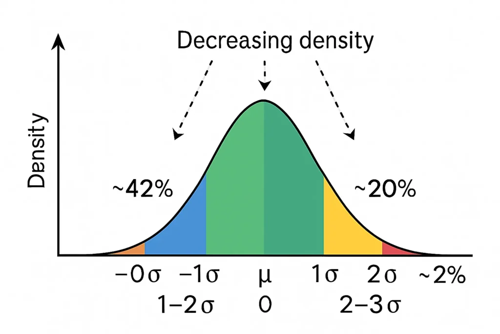
Variance distribution across SD bands in a normal curve shows uneven shares. The 0–1 SD band, nearest the mean, has peak density, so it drives the largest slice—around 42%—as many values create steady squared deviations.
The 1–2 SD band follows with about 36%, where falling density meets rising deviations for a strong but secondary role. By 2–3 SD, lower frequency cuts the share to ~20%, though larger squares keep it relevant.
Beyond 3 SD, the thin tails add just ~2%, as extreme distances can’t overcome rarity. This variance distribution by standard deviation underscores statistical spread—central zones fuel most variability.
If you highlight the region between ±1σ on a bell curve, it appears dense and wide. This density explains why nearly half the variance originates here.
Variance Contribution Formula (Simple Explanation)
The percentage contribution formula conceptually divides variance by SD bands. It’s Contribution (%) = ∫{SD band} (x – μ)^2 f(x) dx / ∫{-∞}^{∞} (x – μ)^2 f(x) dx × 100.
The numerator sums squared deviations weighted by density f(x) over the band, like 0–1σ. The denominator is total variance, equaling σ².
For a standard normal (μ=0, σ=1), it simplifies to percentages. This shows SD band percentage breakdown, where squaring boosts outer impact.
Example: Percentage Contribution of SD Bands in a Normal Distribution
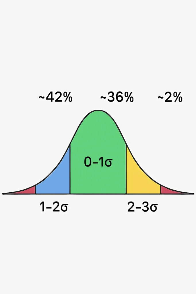
In a normal distribution, variance contributions approximate:
| SD Band | Approx Contribution |
|---|---|
| 0–1 SD | ~42% |
| 1–2 SD | ~36% |
| 2–3 SD | ~20% |
| >3 SD | ~2% |
The 0–1 SD leads as dense clustering yields high cumulative squared deviations. 1–2 SD variance contribution follows, blending moderate elements.
2–3 SD drops but persists via larger squares. >3 SD is tiny, showing tails’ limited role in variance despite dramatic points.
This example illustrates normal distribution variance explanation, scalable to any μ and σ.
Variance Contribution vs Empirical Rule Percentages
Variance contribution differs from empirical rule percentages, which focus on probability:
Empirical rule: 68% within 1σ (probability), 95% within 2σ, 99.7% within 3σ.
Variance weights by squared distance, so central bands overcontribute relative to probability. Tails add more to variance than their tiny probability suggests.
In a probability diagram, the tails are nearly invisible. But in a variance diagram, the 2–3σ band shows a meaningful spike because of its large squared deviations. This highlights empirical rule comparison—frequency vs amplified spread.
Real-World Examples of SD Contribution
In height distribution (μ=170 cm, σ=7 cm), 0–1 SD (163–177 cm) contributes most variance, as most people cluster here with small but frequent deviations.
For test scores (μ=75, σ=10), 1–2 SD (65–85 and 85–95) adds substantial variance, where moderate outliers pull spread.
In measurement error for weights, tails (>3 SD) contribute little overall but can spike variance if errors are extreme, showing why rare faults matter.
These show real-world distribution interpretation, with central dominance and tail subtlety.
Why This Concept Matters
Grasping percentage contribution of standard deviation deepens SD understanding, revealing why outliers inflate variance disproportionately.
It clarifies distribution density changes, aiding analysts in interpreting spread behavior. For teaching, it bridges variance vs probability, enhancing data literacy.
This supports variance vs probability insights, useful in statistics education and beyond.
FAQs
It’s the percentage each SD band adds to total variance in a normal distribution.
High density multiplies many small squared deviations into a large share.
Rare points have huge squared deviations, contributing despite low frequency.
Empirical rule is probability-based; this is variance-weighted by squared distance.
Approximately in normal data, but deviations occur in non-ideal sets—use conceptually.
Related Tools
For interactive variance exploration, try our Standard Deviation Percentage Contribution Calculator. Check density impacts with the Standard Deviation Density Contribution Tool. Analyze broader spreads in the Variance Distribution Analyzer. See SD rankings via the Standard Deviation Importance Score Calculator. For basics, visit our Empirical Rule Calculator.
Conclusion
Understanding percentage contribution of standard deviation uncovers how variance distributes across a normal curve’s bands, with the center leading and tails trailing. Central regions contribute most due to density, while outer zones add via amplified distance—key insight: spread ≠ frequency.
Z-Score to Graph Plotter
Plot Z-scores on a bell curve and see where your value lies. Understand percentiles and probabilities at a glance.
Try CalculatorEmpirical Rule Percentile Calculator
Quickly estimate percentiles in a normal distribution using the 68-95-99.7 rule. Input mean, standard deviation, and a score to find its percentile rank.
Try CalculatorPercentile Rank Calculator
Find your score’s percentile rank without needing mean or standard deviation. Input your score and rank to see where you stand in any dataset.
Try CalculatorNormal Distribution to Percentile Visualizer
Visualize your score on a bell curve with shaded percentile areas. Enter mean, standard deviation, and a score to see its rank in a normal distribution.
Try Calculator