Empirical Rule Graph Generator
The empirical rule, also known as the 68-95-99.7 rule, is a simple yet powerful way to understand how data spreads in a normal distribution. By using an empirical rule graph generator, you can visualize this rule as a bell curve, showing how data clusters around the average. This tool makes it easy for students, teachers, and data enthusiasts to see the rule in action by plotting the percentages of data within one, two, and three standard deviations. Whether you’re exploring test scores, heights, or other datasets, this guide will show you how to create an empirical rule graph and why it’s so useful. Want to try it yourself? Check out our main statistics tool for a hands-on experience.
What Does the Empirical Rule Show?
The empirical rule describes how data is distributed in a normal distribution, which forms a symmetric, bell-shaped curve. It tells us:
68% of data falls within one standard deviation of the mean (average).
95% of data lies within two standard deviations.
99.7% of data is within three standard deviations.
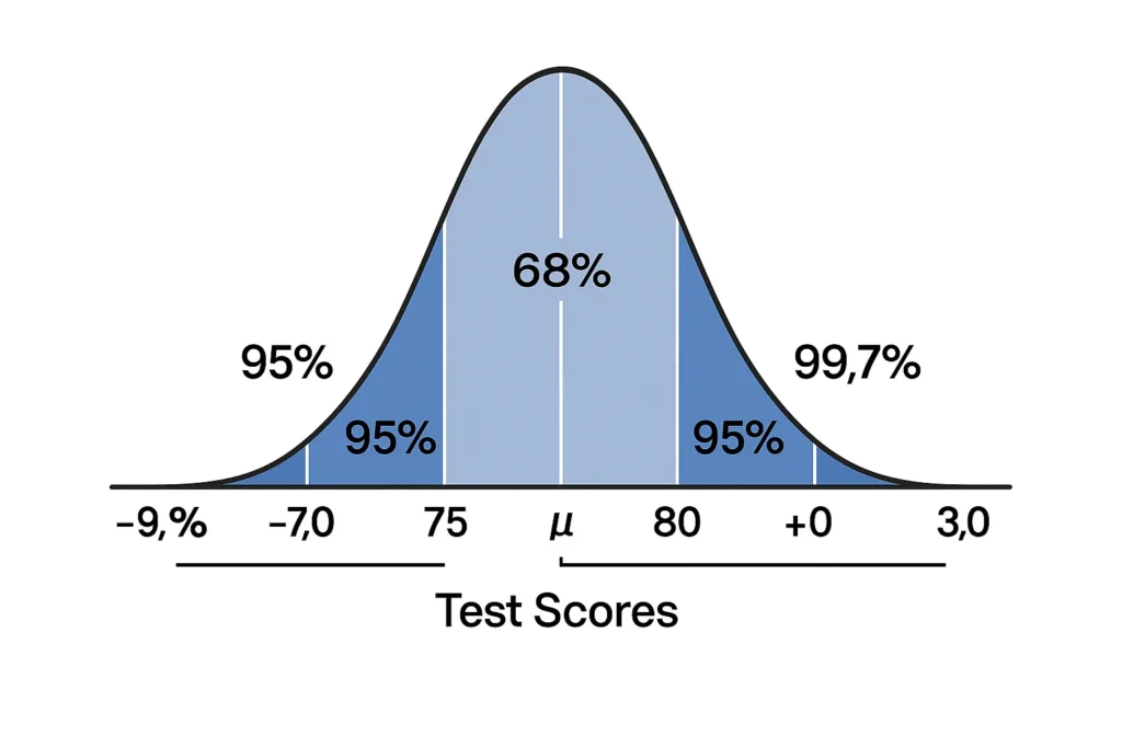
For example, if you’re looking at test scores with an average of 80 and a standard deviation of 5, the empirical rule predicts that 68% of scores are between 75 and 85. This rule applies to datasets like heights, weights, or exam results that follow a bell curve, where most values cluster near the mean and fewer are at the extremes.
The beauty of an empirical rule graph is that it turns these percentages into a visual. The bell curve shows the mean at the center, with shaded areas highlighting the 68%, 95%, and 99.7% regions, making it easy to grasp the data’s spread.
How the Graph Works (Inputs: Mean and Standard Deviation)
Creating an empirical rule graph is straightforward with a graph generator. Here’s how it works:
Enter the Mean (μ): This is the average of your dataset. For example, if you’re studying heights, the mean might be 65 inches.
Input the Standard Deviation (σ): This measures how spread out the data is. For heights, a standard deviation of 2.5 inches means most heights are close to 65 inches.
Generate the Graph: The tool plots a bell curve, centering it at the mean. It shades areas to show:
68% of data within ±1σ (e.g., 62.5 to 67.5 inches).
95% within ±2σ (e.g., 60 to 70 inches).
99.7% within ±3σ (e.g., 57.5 to 72.5 inches).
Customize (Optional): Some tools let you adjust scales or highlight specific ranges for deeper analysis.
Example: For test scores with a mean of 100 and a standard deviation of 10, the graph shows 68% of scores between 90 and 110, with clear visual markers. This helps you see the data’s spread instantly.
Why Use a Visual Tool?
A plot empirical rule tool like the graph generator offers several benefits:
Clarity: Visuals make complex statistical concepts accessible, especially for beginners.
Engagement: Interactive graphs help students and learners explore data dynamically.
Accuracy: The tool calculates and displays precise standard deviation ranges, reducing manual errors.
Versatility: Use it for education, research, or professional analysis in fields like finance or biology.
For example, a teacher can use the graph to show students how exam scores distribute, while an analyst might use it to study product measurements. To enhance your visualizations, try tools like the curve plotting tool or data shading tool for customized graphs.
Did You Know? Visual tools can also plot related metrics, like Z-scores, to dive deeper into data analysis. Explore the Z-score visualizer for this purpose.
FAQs
It’s a visual representation of the 68-95-99.7 rule, showing a bell curve with shaded areas for data within one, two, and three standard deviations of the mean.
The empirical rule describes the percentage of data in a normal distribution, and the bell curve visually shows these percentages as shaded regions around the mean.
You need the mean (average) and standard deviation of your dataset to plot the bell curve and highlight the 68-95-99.7% ranges.
No, the empirical rule only applies to normal distributions. For non-normal data, consider other tools like Chebyshev’s theorem calculators.
It makes the empirical rule intuitive, showing how data spreads in a normal distribution, which is useful for teaching or analyzing real-world data.