Empirical Rule Confidence Zone Visualizer
68% Confidence (±1σ)
-
95% Confidence (±2σ)
-
99.7% Confidence (±3σ)
-
Mean (μ)
100
Std Dev (σ)
15
Variance (σ²)
225
Understanding the Empirical Rule (68-95-99.7 Rule)
- • 68% of data falls within 1 standard deviation (±1σ) from the mean
- • 95% of data falls within 2 standard deviations (±2σ) from the mean
- • 99.7% of data falls within 3 standard deviations (±3σ) from the mean
- • This rule applies to normal (bell-shaped) distributions
- • The visualization shows the probability density curve and shaded confidence zones
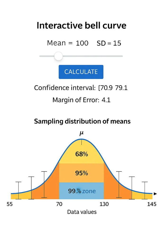
The empirical rule confidence zone calculator brings the 68-95-99.7 rule to life with an interactive bell curve visualizer that instantly shades confidence zones around your data’s mean. Perfect for students, teachers, and analysts, this visual statistics tool helps you see how 1σ, 2σ, and 3σ represent 68%, 95%, and 99.7% of data in a normal distribution. Enter your mean and standard deviation to watch the normal curve with standard deviations transform — no math required. Use this Empirical Rule Confidence Zone Visualizer to see what your calculated interval looks like on a bell curve.
Author:
Prof. Ayesha Khan, M.Sc. Statistics, 12+ years teaching AP Statistics and data visualization.
What Are Empirical Rule Confidence Zones?
Empirical Rule confidence zones are the areas on a bell curve that show where most data falls based on standard deviation from the mean:
68% of data lies within ±1 standard deviation (1σ)
95% within ±2 standard deviations (2σ)
99.7% within ±3 standard deviations (3σ)
These confidence zones are not statistical confidence intervals — they’re descriptive regions showing data spread in a normal distribution. Think of them as your data’s “comfort zones” — where values naturally cluster.
How the Confidence Zone Visualizer Works
This empirical rule diagram tool is simple and powerful:
Enter Mean (μ): Your dataset’s average (e.g., 100).
Enter Standard Deviation (σ): How spread out the data is (e.g., 15).
Select Coverage Level: Choose 68%, 95%, or 99.7%.
Watch the Curve: The bell curve visualizer shades the selected zone and labels the range.
Example:
For mean = 100, SD = 15, selecting 95% highlights the area from 70 to 130 — showing exactly where 95% of data lies.
Hover Tip: Move over shaded areas to see exact bounds and percentage coverage.
The Power of Visual Learning in Statistics
Seeing is understanding. This interactive bell curve helps you:
Grasp Variability: Watch how larger SDs stretch the curve.
Reinforce Concepts: The 68 95 99.7 rule graph makes abstract rules concrete.
Teach Effectively: Ideal for classroom demos or study notes.
Build Intuition: Instantly see how mean and standard deviation zones shape data.
Perfect for visual learning statistics and empirical rule demonstration.
Example: Seeing the 68–95–99.7 Rule in Action
Let’s use a real dataset: exam scores with mean = 50, SD = 10
| Zone | Range | Coverage |
|---|---|---|
| 68% | 40 to 60 | Most students score here |
| 95% | 30 to 70 | Almost all typical scores |
| 99.7% | 20 to 80 | Includes nearly every score |
Difference Between Confidence Zones and Confidence Intervals
| Concept | Based On | Purpose | Example |
|---|---|---|---|
| Confidence Zones | Population data (Empirical Rule) | Show distribution spread visually | Mean ± 1σ, 2σ, 3σ |
| Confidence Intervals | Sample data (Inferential) | Estimate population mean range | Mean ± (Z × SE) |
Key: Zones describe where data lies. Intervals estimate where the true mean is.
To calculate your exact numerical range, try our interval calculator .
Why This Visualizer Is Unique
Purely Graphical: Focuses on visualization, not numbers.
Instant Feedback: Adjust mean/SD and see changes live.
Educational Focus: Built for teachers, students, and infographic creators.
Complements Tools: Pairs perfectly with our probability finder and margin calculator .
Related Tools
Empirical Rule Confidence Interval Calculator: Get numeric ranges
Margin of Error Using Empirical Rule Calculator: Find ±1σ, ±2σ, ±3σ error
Empirical Rule Probability Finder: Calculate probabilities in zones
Normal Distribution to Percentile Visualizer: See where scores rank visually
FAQs
A confidence zone is the shaded area on a bell curve showing where 68%, 95%, or 99.7% of data falls based on standard deviations from the mean.
Yellow = 68% (1σ), Orange = 95% (2σ), Blue = 99.7% (3σ). Each color shows increasing coverage of data.
Yes! Enter any mean and standard deviation to see a custom normal distribution zones calculator in action.
The Empirical Rule shows data spread in a population. A confidence interval estimates the population mean from a sample.
No — it only works well for approximately normal (bell-shaped) data.
Conclusion
The empirical rule confidence zone calculator transforms abstract statistics into clear, visual insights with its bell curve visualizer and shaded confidence area. Whether you’re teaching the 68 95 99.7 rule graph, studying for exams, or creating reports, this visual statistics tool makes normal curve interpretation intuitive. Visualize your data’s spread instantly — use the Empirical Rule Confidence Zone Visualizer to see what your calculated interval looks like on a bell curve. Check Our Main Tool.
Z-Score to Percentile Converter
Convert a z-score to a percentile in a normal distribution. Enter your z-score to see the percentage of data below it, ideal for test scores or analytics.
Try CalculatorEmpirical Rule Probability Finder
Calculate probabilities under a normal distribution using the 68-95-99.7 rule with easy inputs and visual bell curve outputs.
Try CalculatorLeft/Right Tail Probability Calculator
Find left or right tail probabilities in a normal distribution using z-scores, perfect for hypothesis testing and p-values.
Try CalculatorProbability to Z-Score Approximation Tool
Convert cumulative probabilities to z-scores in a normal distribution, ideal for test scores and data analysis.
Try Calculator