Real-Life Applications of Percentiles in Normal Distribution
Percentiles are widely used in education to compare student performance, especially in standardized tests like the SAT, GRE, or ACT, which often follow a normal distribution. A score in the 90th percentile means a student did better than 90% of test-takers, providing a clear ranking.
Example: Sarah scores 1350 on the SAT, placing her in the 90th percentile. This means her score is higher than 90% of all test-takers, helping colleges assess her academic strength. In a normal distribution, test scores cluster around the mean (e.g., 1000 for SAT), with fewer students at the extremes, making percentiles a reliable way to interpret results.
Schools also use percentiles for class rankings or grading curves. For instance, a teacher might use percentiles to identify top performers or students needing extra support. To calculate your test score’s percentile, try our percentile calculator .
Education – Grading and Test Scores
A percentile indicates your position in a dataset, showing what percentage of values are below yours. If your score is in the 80th percentile, you outperformed 80% of the group. It’s a ranking tool, always based on comparison to others.
Example: If your SAT score is in the 90th percentile, you scored better than 90% of test-takers. This means your score ranks high, but it doesn’t tell you the chance of getting that score again. For more on percentile rankings, see our rank calculator .
Percentiles are widely used in education, testing, and performance evaluations because they show relative standing in a clear, intuitive way.
Intelligence Testing – IQ Percentiles
IQ scores are a classic example of a normal distribution, with a mean of 100 and a standard deviation of 15. Percentiles help interpret IQ percentile examples, showing how an individual’s intelligence compares to the population.
Example: An IQ score of 130 has a z-score of (130 – 100) / 15 = 2, placing it in the 98th percentile. This means the person’s IQ is higher than 98% of others, often qualifying them for gifted programs. Conversely, an IQ of 85 (z-score = -1) is in the 16th percentile, indicating it’s below average.
These percentile examples in everyday life are used by educators and psychologists to assess cognitive abilities and tailor educational plans. To convert IQ scores to percentiles, use our z-score tool .
Healthcare – Growth and BMI Charts
In healthcare, percentiles are critical for tracking metrics like height, weight, and BMI, especially in children, where data often follows a normal distribution. Percentile in health statistics helps doctors assess whether a patient’s measurements are typical for their age and gender.
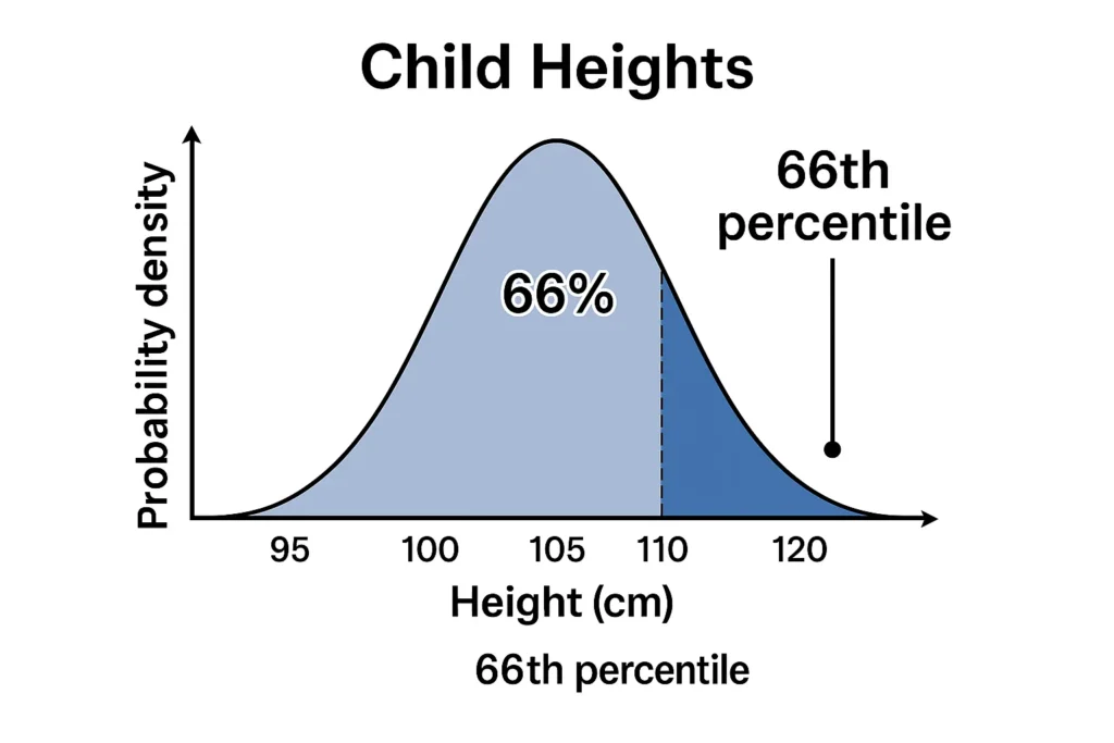
Example: A 5-year-old boy’s height is in the 60th percentile, meaning he’s taller than 60% of his peers. If his height is 110 cm, with a mean of 108 cm and standard deviation of 5 cm for his age group, his z-score is (110 – 108) / 5 = 0.4, roughly the 66th percentile. This helps pediatricians monitor growth and detect potential issues.
Similarly, BMI percentiles guide obesity assessments. A BMI in the 95th percentile might prompt lifestyle recommendations. For visualizing these percentiles, check out our distribution visualizer.
Business & Hiring – Performance Rankings
In business, percentiles rank employee performance, sales, or productivity, often assuming a normal distribution of outcomes. This helps managers make fair, data-driven decisions about promotions, bonuses, or training needs.
Example: A sales team’s monthly revenue has a mean of $50,000 and a standard deviation of $10,000. An employee generating $70,000 is in the 97.7th percentile (z-score = 2), meaning they outperform 97.7% of the team. This could qualify them for a bonus or leadership role.
Percentiles provide a clear way to compare employees without complex calculations. For ranking performance in any dataset, try our rank calculator .
Sports and Fitness Metrics
Athletes and coaches use percentiles to compare performance metrics like sprint times, VO2 max, or strength, which often follow a normal distribution. These real world percentile examples help identify top performers or set training goals.
Example: A runner’s 100-meter sprint time of 11 seconds is in the 75th percentile among a group, meaning they’re faster than 75% of peers. If the group’s mean time is 11.5 seconds with a standard deviation of 0.5 seconds, the z-score is (11 – 11.5) / 0.5 = -1, confirming the 75th percentile (since negative z-scores are below the mean).
This helps scouts spot talent or athletes track progress. For more on how percentiles differ from probabilities, see percentile concepts .
Why Understanding Percentiles Matters
Percentiles are powerful because they:
Simplify Comparisons: They show where you stand relative to others, like ranking in a class or team.
Standardize Decisions: Percentiles provide a consistent way to evaluate performance across diverse fields.
Make Data Relatable: They translate raw numbers into meaningful rankings, like knowing a child’s growth is “above average.”
In normal distributions, percentiles align with the 68-95-99.7 rule, making them intuitive for datasets like test scores or medical metrics. Using tools like our main statistics tool helps you apply percentiles to your own data.
FAQs
A student’s SAT score in the 85th percentile means they scored higher than 85% of test-takers, helping colleges compare applicants.
Yes, the 90th percentile is excellent, indicating performance better than 90% of the group, like a top test score or high sales output.
Percentile in health statistics tracks metrics like height or BMI. A child in the 75th percentile for weight is heavier than 75% of peers, guiding health assessments.
Schools use percentiles to rank students fairly, showing how a score compares to others, like identifying top performers for honors programs.
Yes, percentiles inform decisions in education (e.g., admissions), business (e.g., bonuses), and health (e.g., growth monitoring) by providing clear rankings.
Conclusion
Percentiles in normal distributions are a versatile tool for understanding where you stand in real-world scenarios, from percentile in real life examples like test scores and IQs to growth charts and employee rankings. By showing how a value compares to others, percentiles simplify complex data and guide decisions in education, healthcare, business, and sports. The normal distribution in daily life makes these rankings intuitive, especially with the bell curve’s predictable pattern. Explore your own data with our main statistics tool , percentile calculator , z-score tool , rank calculator , distribution visualizer , or dive into percentile concepts to deepen your understanding of applications of percentile.
Empirical Rule Graph Generator
Visualize the 68-95-99.7 Rule with a bell curve showing standard deviation intervals. Great for quick insights and presentations.
Try CalculatorBell Curve Generator
Create customizable bell curve plots for any normal distribution. Perfect for data analysis and visual reports.
Standard Deviation Shading Calculator
Shade areas under the curve based on standard deviation. Instantly see data coverage between values.
Try CalculatorZ-Score to Graph Plotter
Plot Z-scores on a bell curve and see where your value lies. Understand percentiles and probabilities at a glance.
Try Calculator